Шрифт Marseille Tarot
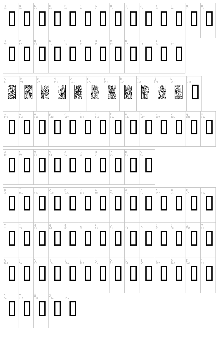
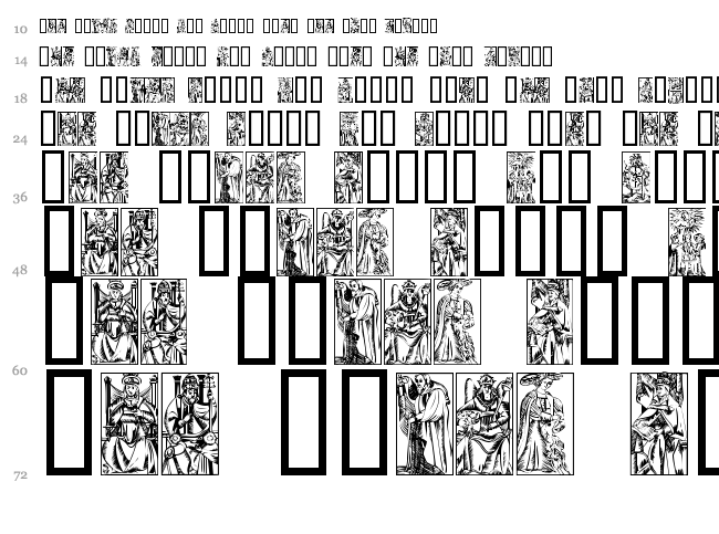
Вы находитесь на странице шрифта Marseille Tarot.
Это демо версия шрифта. Обычно, такая версия содержит ограниченное количество доступных символов. Публикация шрифта на Fontzzz.com состоялась 17.09.2012 в 23:48. Он был помещен в категорию "Дингбаты - Эзотерические". Версия шрифта Marseille Tarot - "". Вы можете скачать шрифт Marseille Tarot совершенно бесплатно и без регистрации, кликнув по ссылке "Скачать шрифт". Данный шрифт был сжат в ZIP-архив для вашего удобства. Архив содержит 1 файлов шрифтов.
От автора
SCRIPTORIUM FONT LIBRARY MINI-MANUAL
EXTRACTION
Our fonts come with the files stuffed in a single archive file
using Stuffit for the Macintosh or PKunZip for the PC. To extract Stuffit
archives, just click on them and they will unstuff to the destination you
specify. To extract PKZip archives you will need a copy of PKunZip. If
you don't have a current copy you can obtain one from almost any local
bulletin board or online service, or from our BBS at 512/472-6905.
INSTALLATION
Macintosh: If you are using System 7 all you need to do is drop the
fonts you wish to use on your system folder and they will automatically be
placed in the Font folder. If you are using an older version of the system
software you will need to drop the fonts on the system file itself. Before
installing fonts determine whether you wish to use True Type or Postscript.
For Postscript install the .bmap file and the file with no suffix. For
Trutype just install the .suit file. Do not install both Postscript and
Truetype unless you rename one of the suitcases so that they will not
conflict.
MS DOS: Where you install the fonts will depend on the program you
are using. Consult your manual for more information.
Windows: Click on the Control Panel icon. In the Control Panel
click on Fonts icon. Select add fonts. In some cases you may need to also
add the fonts specifically to the programs you are using. Consult the
program manual for more information.
TROUBLESHOOTING
Font Appears as Boxes (Macintosh): First, check to make sure that
none of the characters display properly. Some calligraphic, display and
decorative initials fonts may have only upper or lower case characters, but
not both. This is not a defect, but a traditional characteristic of those
types of alphabets. This is an indication that the font is too complex for
the memory configuration which you are currently using. This is most
likely to happen when using the Postscript versions under system 6.X, on a
68000 Macintosh, or on a system with less than 4 megabytes of system
memory. However, with more complex fonts it can occur with more powerful
systems. It can also be the result of programs which have poor memory
management. In some cases assigning additional memory to the application
you are using can solve this problem, but the more complex the font is, the
more memory it demands. We have never encountered any problems on any
systems which have a 68030 or better processor and at least 8 megabytes of
memory, but some of the newer Macintoshes, although nominally equivalent to
an SE/30 or better, have inexplicably poor memory management. In the worst
case scenario your system just may not be able to run some of the most
complex fonts without some sort of hardware or software upgrade.
Font Not Visible on Screen or Appears Only in Small Point Sizes
(PC): This is essentially the same problem as the one noted above on the
Macintosh. It means that your system is not powerful enough to handle the
number of points in the font you're trying to use. This problem is
particularly troublesome with PCs running Windows, but it will be fixed
with the release of Windows95. This generally occurs with art and
decorative initials fonts, but the limitations on the PC are even more
severe than on the Macintosh, so on older systems it may occur with less
complex fonts as well. It is less likely to happen with TrueType fonts
than with Postscript, and can only be dealt with by getting a more powerful
PC. Generally a 486 or better with at least 8 megabytes of memory should
have no problems. If you cannot upgrade your hardware you may find that you
can still use the more complex fonts in a limited context. Generally you
should be able to use smaller point sizes with multiple characters, or
print one or two individual characters in larger point sizes, even if they
don't appear on the screen.
Font Appears Not to Have Apostrophes: This is a quirk of certain
word processing programs which can be configured to use a non-standard
apostrophe character in place of the standard apostrophe included in all
our fonts. Some programs, including Microsoft Word may come configured to
use the alternative apostrophes. Consult your manual to reconfigure the
software, or for the key combination necessary to access the correct
apostrophe.
Font Prints with Rays or Lines on it: Generally a problem with
Postscript versions of the most complex fonts and certain art or font
sampling programs. Not much you can do except try a different program.
Font Prints Only Some Lines of Some Characters (PC): This is
another function of PCs with insufficient memory, generally only with those
fonts with many overlapping points, particularly decorative initials. This
may be fixable by changing the settings on your printer (see printer
manual). Alternatively it should not be a problem if you print only a few
characters at a time, which is normal use for this type of font anyway.
Предварительный просмотр
Карта шрифта
Водопад
Еще шрифты:
Автор: Iacy
Добавлен:
2013-02-28
Просмотров:
7672
Загрузок:
260
Автор: Dieter Steffmann
Добавлен:
2012-02-25
Просмотров:
5273
Загрузок:
194
Автор: Listemageren
Добавлен:
2014-01-28
Просмотров:
5019
Загрузок:
150
Автор: Andrew D. Taylor
Добавлен:
2013-05-10
Просмотров:
7759
Загрузок:
346
Автор: mdta
Добавлен:
2013-01-06
Просмотров:
9185
Загрузок:
383


