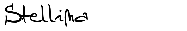
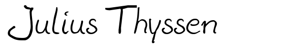
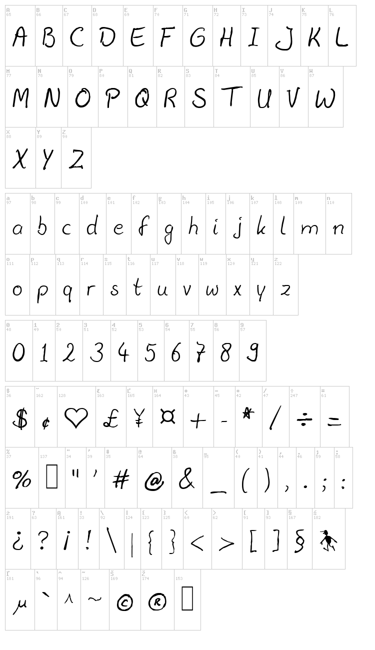
Шрифт Julius Thyssen дизайнера Julius B. Thyssen
Вы находитесь на странице шрифта Julius Thyssen. Он был создан дизайнером Julius B. Thyssen. Лицензия, по которой распространяется данный шрифт, неизвестна. Вы можете связаться с автором для уточнения условий коммерческого использования. Публикация шрифта на Fontzzz.com состоялась 18.06.2020 в 23:40. Он был помещен в категорию "Рукописные - Рукописные". Версия шрифта Julius Thyssen - "September1-1998 release". Вы можете скачать шрифт Julius Thyssen совершенно бесплатно и без регистрации, кликнув по ссылке "Скачать шрифт". Данный шрифт был сжат в ZIP-архив для вашего удобства. Архив содержит 1 файлов шрифтов.
От автора
Dear reader,
9juliust.ttf is designed and produced entirely from scratch by me, Julius.
It's one of my handwriting-derived fonts, I created it for personal use.
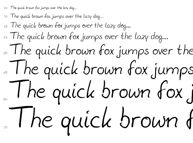
This "Julius B Thyssen" TrueType is rather lightweight, but so should
any scanned Parker-blue ballpoint-written material be, I think.
When you use it for bulk, you'll get very nice-looking results printing
it at 14-16 points size, with line/paragraph height set around 17 points.
I've also used it quite often for large headers with a shade or dropshadow.
Looks nice with this font.
First version came about in 1993 by use of a scanner, Photoshop,
Freehand, Coreltrace, Old Fontographer and Fontmonster. Yes, 1993,
and it was a hell of a job! Soon after I had printed some letters
using this font, people started telling me things like:
"Wow man, is that your handwriting? Can I have it too? It's beautiful!"
I decided to give it a try and put one of the early versions of this
font out on a CD-ROM that I was publishing for a Sybex-computer-book ||
in the Netherlands. The file you have gotten with this text however, \/
is a later and improved version, and I very much like older versions
to be replaced by this one, so I released it for internet-distribution.
This 6th version of 9juliust.ttf was generated September 1998.
A driving force behind this update has been Jolanda de Putter, a very
sexy girl I fell in love with back then. Pity it wasn't all mutual..
Jolanda was crazy about my letters though, printed using this font !
I'm still not entirely sure about some details. The "e" for example
used to be a little small, now it seems too large again.
You can always check for new versions. (Please do!) This font and some
others I've made can be obtained through a download-page on the www,
http://jthz.com will take you there.
Have fun with the font, hope you find a use for it! If you do,
and you're the rich successful type of person, please
transfer some money to dutch bank-account nr. 0945945, on my name
and I live in Amsterdam (they need that, I think). My IBAN,
International Bank Account Number is: NL77PSTB0000945945
Don't let the website fool you into thinking I'm rich,
that's far from the truth; I create things pro-bono.
Julius B. Thyssen | fonts@jult.net
=============================================================================
THANKS AND ALL THAT More font-info follows...
This planet suffers from so many problems it would be insane to pretend
they aren't there, BUT, life will be a whole lot easier if people simply
give each other more what they want from each other, and not make it all
so hard for themselves. It's really not that hard. You just do it. So..
You are allowed to freely use the font(s) for a month or so, but
if you want to continue using it you must "pay" by sending the author
a nice warm "thank-you!" email to this address:
In case you have a personal homepage on the www, pages on the internet,
please send us the URL so we can get some idea who and where you are,
we like that kinda email.
As of the moment your email has arrived, you are allowed to use the font(s)
for as long and as much as you want, without any other cost. You then
also have the right to update them when new versions come out.
Please note that this "payment" is strictly personal. Everyone who uses
the font(s) has to register, even if someone else installed it on your
computer or if you found it on some CD-ROM you bought. (You paid for
the CD, not for the font.)
However, if you've won a lottery, PLEASE be so kind and dump 1% of the prize
on dutch Postbank-account-nr. 945945 't.n.v. J.B.Thyssen', Amsterdam, NL.
Or snail-mail your stuff to JTHZ via the whois address of jthz.com
DISTRIBUTION
Freely give copies of ALL or SOME of the TrueType-files to others, but
make sure all the non-font-files (txt, com, etc.) are always included
in the distributed segment, and that all copied files are unmodified.
If you are a COMMERCIAL ENTERPRISE (selling disks or whatever),
you may distribute ALL or SOME of the font-files included in this
package without our permission, as long as you send us part of the
profits. When we find out you made money on our fonts and you never
paid us anything, we will personally damage your software by telekinesis
or make you familiar with some of our gezellige viruses. And if we bump
into modifications, we WILL try and trace the source and somehow prosecute
;-) And if you really have to rename or modify one or more of our fonts,
be smart and change *all* stuff referring to us !
Tips for using the TrueTypes
- Because of the absolute nature of automatic kerning-pair data (KPX),
we advise you to switch on auto-KERNING PAIRS only for point-sizes 14
and larger ! Don't make use of kerning below 14 points,
this significantly lowers legibility of the fonts.
- ALL our fonts contain a paragraph symbol! In some cases it isn't your
average paragraph thingy, but this is done only where the typeface
did not have one to begin with; We've put it there for reasons
of visibility-ease in DTP/word-processing. (Don't you hate that
when you can't seem to get one out of a font at all?)
- They are equipped with Fs-code Type 0, which basically means you can
embed them, save them embedded, print them after embedding,
edit them and use them all the way through the process,
without 'falling-out of the font'.
- Almost all fonts by _JTHZ_ have Font-specific encoding!
- Thanks to the vast breaking take-over of high-resolution equipment
(printers and monitors), hinting (meant for low-resolution equipment)
in these fonts was not considered as important as it used to be
in the old-days. Try test-printing the fonts high-resolution before
writing them off as strange- or bad-looking (low screen-resolution
might fool you into believing how the fonts really look...).
Just remember that what you see on your screen is usually of lower
quality than what you will get out of your printer!
- Be advised that the US and Dutch versions of Windows (up to 95)
do not allow access to characters above decimal nr. 255. This is
why we 'upgraded' some much-used symbol-encoded characters up to
availability in the Windows Character Map. Now you can use them
without having to switch unicode-configuration.
- Most font-files include our new and improved extended vision of
kerning pairs, based on practical and scientific interpretation of
American AND European character combinations in modern use of text
today. These pairs are unique for each font and carefully chosen!
Liable fonts by _JTHZ_ Productions
Generally speaking a truetype font-file created by _JTHZ_
will never crash or halt your program/application. Some former
publications of the fonts in this ZIP were bad in several ways
(hey, we were not to blame, slackspace-creators Microsoft
can actually suck sometimes). If _JTHZ_'s fonts still
give you any problem whatsoever we are now proud to say it HAS to be
the application where you encounter the problem, and can never be
any of our fonts! As opposed to lots of TrueTypes available today,
the J-fonts DO print all characters correctly and in normal use
do not mess up your product! Our hearts were in creating reliable
quality, not in making money or re-assuring the creation of updates
or improved versions by not finishing up a font. We have confidence
that the data put in the fonts is fully according to the specs, but
in order to be 'DOS-friendly' we had to limit creation data structure
to 64k. Fonts consisting of hundreds of characters will likely reach
that 64k limit on sizes above 96 points. Some fonts therefore are not
liable to be created at very large point-sizes. (Some characters might
dropout and disappear). We must stress that this is not related to the
J-fonts in particular, but to all existing TrueTypes. We have worked
our asses off in limiting the data to the lowest possible size.
We even figured out the totally wacky TrueType-standards and
drop-out-scheme. We believe it's safe to say that these fonts are
EXTREMELY WELL-TESTED. Many hours were spent on low-level editing
and deciphering the wired backgrounds in the TrueType format.
Some of the fonts (Corrodated and Frosty Typewriter for example) are
really packed with vector-data. In such cases we don't feel responsible
if you encounter problems using them; It has nothing to do with us.
Whatever strangeness you might find in some characters, they were all
meant to be that way and are not mistakes of any kind. This is
APART FROM THE HACKIES THAT MAY APPEAR ON SCREEN
IN SMALL SIZES WITH LOW RESOLUTION
Making (outline) Fonts is very, very difficult. Many people imagine
that there are programs that will simply convert pictures into fonts
for them. This is not the case; most fonts are painstakingly created by
drawing curves that closely approximate the letterforms. In addition,
special rules (which improve hinting, etc.) mandate that these curves
be drawn in specific ways. Even designing, or merely digitizing
a simple font can take hundreds of hours. As of the point where you
have an idea for a font, everything starts to get better and better-
looking every little step of the way. We suppose there aren't many
things in life which can be as rewarding as creating printable fonts,
and that is probably why many still create them..
Some philosophy behind our fonts
The demand for new and original fonts is growing more than ever before.
Reasons to try out other new collections; We hereby present a set of
very distinguished and original fonts. Some are inspired by existing
fonts and typical character-improvements of a typeface, others are
totally new or have never been 'digitized' or 'vectored' by us
before being truetyped.
When someone thinks about needing a font for a certain purpose,
in the end that someone will always select a font by its look, and NOT
(as the industry sometimes tries to make us believe) by looking at the
(describing) written data of the font. Some typographic standards
tend to forget what fonts are used for in the first place;
There is a standard, Panose, but it is mostly ignored by typographers
(not because it's bad, just because they don't need it).
The Panose system is documented, among other places, in the
Microsoft Windows Programmer's Reference from Microsoft Press.
But as is the EULA (end user license agreement), it seems invented by
a group of incompetent people, not knowing shit about the software.
Panose is a perfect example of what got out of hand in visions
about fonts. Panose came up with a scary, limiting-your-choice kinda,
creepy "manual" for placing your font in certain useless groups that
are (what else can you expect in defining human art?!) never clearly
defined. In the making of the J-fonts by _JTHZ_ we agreed in
opposing against all these obscurely made-up classifying-crap
by often choosing categories like "Any", "Don't Care" and/or "0".
Strange as it may sound, they actually wanted us to believe in
splitting a Serif Style in No fit, Cove, Obtuse cove, Square cove,
Obtuse square cove, Square, Thin, Bone, Exaggerated, Triangle,
Normal sans, Obtuse sans, Perp sans, Flared or Rounded.
Never could we think of one font that would fit into just one of them.
They also thought of specifying the proportion of the font into
No fit, Old style, Modern, Even width, Expanded, Condensed,
Very expanded and Very condensed. Makes one wonder when a definition
like 'Modern' ever becomes outdated, or what happens if you decide
to manufacture fonts and put them all in the 'No Fit'-category???
Will those fonts simply refuse to appear in some never-used font-
grouping systems and therefore never be used??? Handy, ain't it?
Believe it or not, we were also asked to specify the 'contrast'
of our created fonts. We'd have -of course- limited choices:
Any, No fit(again!), None, Very low, Low, Medium low, Medium, Medium
high, High or Very high. How can a font (a vector graphic in essence)
ever have a contrast before it is processed by a user? And if there
is one, how would a font look when the contrast is 'None' ???
Can we then still see the font, that is the question...
Hell, they even think one font has strictly one type of
stroke variation. Limiting terms like Gradual/diagonal,
Gradual/transitional, Gradual/vertical, Rapid/horizontal,
Instant/vertical should do. What were they thinking?
It never ended; We had to specify the style for the 'arms' in the font!
And only had 11 options! And the letter form, the style of the midline
for the font (options like Standard/trimmed Standard/serifed
High/pointed High/serifed Constant/serifed Low/trimmed etc.
really made us nervous!).
And how can they expect a font to have only one x-height!? It seems
as if they made up a whole science around just that aspect of a font.
"WHO CARES?" we ask them. Where lie the exact borders between
Constant/small and Constant/standard or Ducking/standard and
Ducking/large? Oh and really; Who needs to know this?
Surprisingly enough Windows 95 divides and matches fonts in its
installation list by their Panose-data. This is strange, especially
when you look at how many fonts today don't have that information in
them. Windows95 easily assumes there is NO PANOSE-data available in
most of our fonts, while we had chosen the 'any fit' and 'no fit'
Panose-options. If that was no Panose-data to begin with, why put the
option there for font-creators? ALL J-fonts DO have Panose information,
despite the NO-PANOSE-DATA warning in WIN95. We don't know what this
means. Is Microsoft getting paid to do this? By whom and why?
What's the use? Don't you get bored using those same old fonts
time and time again? Try something different for a change!
Most of the J-fonts have ID-code-nrs. that are not as unique as the
font IS. This has to do with a generally existing flaw in the given
explanation as to what exactly "unique ID's" are being used for.
If the number tells some goody-two-shoes-geek that there is already
another font with the same code, we're sorry to have used these
existing numbers. It's simply because they work. We didn't feel
like en- or sub-scribing according to the (apparently somewhere
available) official route; This saves us lots of time & effort:
Difficult-to-understand for-no-useful-reason-added-ID's should not
frustrate the creation-process of (new & original) fonts, should they?
We don't feel that this opinion damages the software-industry in any way,
if anything, it encourages creators to do something really worthwhile.
The thing is: all programs needed for the full creation-process of a
TrueType are out there, the spreading media are there, so what exactly
is the point of first having to contact some state-controlled font-
company before others can use your creations? We chose the hack
around it. (And there obviously IS a lot of hacking possible in a
TrueType font.) We've tested the fonts on several computers, with a
diversity of types of programs. They function to our expectations,
in all different configurations with many types of DTP-applications.
The best designed fonts ARE scalable. A well designed 5pt font
will be its 10 pt counterpart 50% scaled down.
Some more general advice
No one can teach you font aesthetics; it must be learned by example
and experience. Look around you with wide eyes and an open mind, and
soon you will find that you know what to do where, with any font.
Motivation and interest are the key-words for successful use.
Never lose track of the kind of work you're doing. An effect that
would ruin a newsletter might be just the thing for a record cover.
Know when you can safely sacrifice legibility for artistic effect.
The 'Immortal Galaxy'-font for example starts to be useful at 24
points size. Smaller use just does not apply for that font.
Running some comparative tests is a good idea. Better to blow off
a few sheets of paper now than to see a problem after thousands of
copies are made. Just use your thinking, that's all we can say really..
Many people feel that bold or italic type is more legible:
"This is the most important part of the newsletter, let's put it
in bold." In fact, legibility studies show that such type is actually
harder to read in bulk. Keep the text in a normal style and weight,
and find another way to emphasize it - box it, illustrate it,
run it in color, position it focally.
It seems to be the consensus of the comp.fonts community that
"you get what you pay for." This is (as of 1994 if you'd ask me)
no longer the case. If you need a professional quality font, you
do not necessarily have to get it from a so-called professional.
Font-software wasn't made by professionals to begin with.
(You only have to look closer into the silly encoding
to know how stupid the inventors were...)
WARRANTY ?
THIS SOFTWARE CAN SUFFER ONLY FROM THE NOT-INVENTED-HERE SYNDROM;
WE ARE NOT THE CREATORS OF THE SYSTEM(S) IN WHICH THEY'RE USED,
IF WE WERE, IT WOULD PROBABLY HAVE BEEN BETTER...
=========================================================================
This text was written by J.B.Thyssen (c)1983-2004 for Men Without Plan
Enterprises. All TTF-names are TRADEMARKS of JTHZ Productions. All other
trademarks mentioned herein are trademarks or registered trademarks
of their respective corporations, and are hereby acknowledged. The
information contained in this documentation is subject to revision
and/or alteration without prior notice. This documentation represents
no obligation, expressed or implied, on the part of the author(s).
=========================================================================
9juliust.ttf is designed and produced entirely from scratch by me, Julius.
It's one of my handwriting-derived fonts, I created it for personal use.
This "Julius B Thyssen" TrueType is rather lightweight, but so should
any scanned Parker-blue ballpoint-written material be, I think.
When you use it for bulk, you'll get very nice-looking results printing
it at 14-16 points size, with line/paragraph height set around 17 points.
I've also used it quite often for large headers with a shade or dropshadow.
Looks nice with this font.
First version came about in 1993 by use of a scanner, Photoshop,
Freehand, Coreltrace, Old Fontographer and Fontmonster. Yes, 1993,
and it was a hell of a job! Soon after I had printed some letters
using this font, people started telling me things like:
"Wow man, is that your handwriting? Can I have it too? It's beautiful!"
I decided to give it a try and put one of the early versions of this
font out on a CD-ROM that I was publishing for a Sybex-computer-book ||
in the Netherlands. The file you have gotten with this text however, \/
is a later and improved version, and I very much like older versions
to be replaced by this one, so I released it for internet-distribution.
This 6th version of 9juliust.ttf was generated September 1998.
A driving force behind this update has been Jolanda de Putter, a very
sexy girl I fell in love with back then. Pity it wasn't all mutual..
Jolanda was crazy about my letters though, printed using this font !
I'm still not entirely sure about some details. The "e" for example
used to be a little small, now it seems too large again.
You can always check for new versions. (Please do!) This font and some
others I've made can be obtained through a download-page on the www,
http://jthz.com will take you there.
Have fun with the font, hope you find a use for it! If you do,
and you're the rich successful type of person, please
transfer some money to dutch bank-account nr. 0945945, on my name
and I live in Amsterdam (they need that, I think). My IBAN,
International Bank Account Number is: NL77PSTB0000945945
Don't let the website fool you into thinking I'm rich,
that's far from the truth; I create things pro-bono.
Julius B. Thyssen | fonts@jult.net
=============================================================================
THANKS AND ALL THAT More font-info follows...
This planet suffers from so many problems it would be insane to pretend
they aren't there, BUT, life will be a whole lot easier if people simply
give each other more what they want from each other, and not make it all
so hard for themselves. It's really not that hard. You just do it. So..
You are allowed to freely use the font(s) for a month or so, but
if you want to continue using it you must "pay" by sending the author
a nice warm "thank-you!" email to this address:
In case you have a personal homepage on the www, pages on the internet,
please send us the URL so we can get some idea who and where you are,
we like that kinda email.
As of the moment your email has arrived, you are allowed to use the font(s)
for as long and as much as you want, without any other cost. You then
also have the right to update them when new versions come out.
Please note that this "payment" is strictly personal. Everyone who uses
the font(s) has to register, even if someone else installed it on your
computer or if you found it on some CD-ROM you bought. (You paid for
the CD, not for the font.)
However, if you've won a lottery, PLEASE be so kind and dump 1% of the prize
on dutch Postbank-account-nr. 945945 't.n.v. J.B.Thyssen', Amsterdam, NL.
Or snail-mail your stuff to JTHZ via the whois address of jthz.com
DISTRIBUTION
Freely give copies of ALL or SOME of the TrueType-files to others, but
make sure all the non-font-files (txt, com, etc.) are always included
in the distributed segment, and that all copied files are unmodified.
If you are a COMMERCIAL ENTERPRISE (selling disks or whatever),
you may distribute ALL or SOME of the font-files included in this
package without our permission, as long as you send us part of the
profits. When we find out you made money on our fonts and you never
paid us anything, we will personally damage your software by telekinesis
or make you familiar with some of our gezellige viruses. And if we bump
into modifications, we WILL try and trace the source and somehow prosecute
;-) And if you really have to rename or modify one or more of our fonts,
be smart and change *all* stuff referring to us !
Tips for using the TrueTypes
- Because of the absolute nature of automatic kerning-pair data (KPX),
we advise you to switch on auto-KERNING PAIRS only for point-sizes 14
and larger ! Don't make use of kerning below 14 points,
this significantly lowers legibility of the fonts.
- ALL our fonts contain a paragraph symbol! In some cases it isn't your
average paragraph thingy, but this is done only where the typeface
did not have one to begin with; We've put it there for reasons
of visibility-ease in DTP/word-processing. (Don't you hate that
when you can't seem to get one out of a font at all?)
- They are equipped with Fs-code Type 0, which basically means you can
embed them, save them embedded, print them after embedding,
edit them and use them all the way through the process,
without 'falling-out of the font'.
- Almost all fonts by _JTHZ_ have Font-specific encoding!
- Thanks to the vast breaking take-over of high-resolution equipment
(printers and monitors), hinting (meant for low-resolution equipment)
in these fonts was not considered as important as it used to be
in the old-days. Try test-printing the fonts high-resolution before
writing them off as strange- or bad-looking (low screen-resolution
might fool you into believing how the fonts really look...).
Just remember that what you see on your screen is usually of lower
quality than what you will get out of your printer!
- Be advised that the US and Dutch versions of Windows (up to 95)
do not allow access to characters above decimal nr. 255. This is
why we 'upgraded' some much-used symbol-encoded characters up to
availability in the Windows Character Map. Now you can use them
without having to switch unicode-configuration.
- Most font-files include our new and improved extended vision of
kerning pairs, based on practical and scientific interpretation of
American AND European character combinations in modern use of text
today. These pairs are unique for each font and carefully chosen!
Liable fonts by _JTHZ_ Productions
Generally speaking a truetype font-file created by _JTHZ_
will never crash or halt your program/application. Some former
publications of the fonts in this ZIP were bad in several ways
(hey, we were not to blame, slackspace-creators Microsoft
can actually suck sometimes). If _JTHZ_'s fonts still
give you any problem whatsoever we are now proud to say it HAS to be
the application where you encounter the problem, and can never be
any of our fonts! As opposed to lots of TrueTypes available today,
the J-fonts DO print all characters correctly and in normal use
do not mess up your product! Our hearts were in creating reliable
quality, not in making money or re-assuring the creation of updates
or improved versions by not finishing up a font. We have confidence
that the data put in the fonts is fully according to the specs, but
in order to be 'DOS-friendly' we had to limit creation data structure
to 64k. Fonts consisting of hundreds of characters will likely reach
that 64k limit on sizes above 96 points. Some fonts therefore are not
liable to be created at very large point-sizes. (Some characters might
dropout and disappear). We must stress that this is not related to the
J-fonts in particular, but to all existing TrueTypes. We have worked
our asses off in limiting the data to the lowest possible size.
We even figured out the totally wacky TrueType-standards and
drop-out-scheme. We believe it's safe to say that these fonts are
EXTREMELY WELL-TESTED. Many hours were spent on low-level editing
and deciphering the wired backgrounds in the TrueType format.
Some of the fonts (Corrodated and Frosty Typewriter for example) are
really packed with vector-data. In such cases we don't feel responsible
if you encounter problems using them; It has nothing to do with us.
Whatever strangeness you might find in some characters, they were all
meant to be that way and are not mistakes of any kind. This is
APART FROM THE HACKIES THAT MAY APPEAR ON SCREEN
IN SMALL SIZES WITH LOW RESOLUTION
Making (outline) Fonts is very, very difficult. Many people imagine
that there are programs that will simply convert pictures into fonts
for them. This is not the case; most fonts are painstakingly created by
drawing curves that closely approximate the letterforms. In addition,
special rules (which improve hinting, etc.) mandate that these curves
be drawn in specific ways. Even designing, or merely digitizing
a simple font can take hundreds of hours. As of the point where you
have an idea for a font, everything starts to get better and better-
looking every little step of the way. We suppose there aren't many
things in life which can be as rewarding as creating printable fonts,
and that is probably why many still create them..
Some philosophy behind our fonts
The demand for new and original fonts is growing more than ever before.
Reasons to try out other new collections; We hereby present a set of
very distinguished and original fonts. Some are inspired by existing
fonts and typical character-improvements of a typeface, others are
totally new or have never been 'digitized' or 'vectored' by us
before being truetyped.
When someone thinks about needing a font for a certain purpose,
in the end that someone will always select a font by its look, and NOT
(as the industry sometimes tries to make us believe) by looking at the
(describing) written data of the font. Some typographic standards
tend to forget what fonts are used for in the first place;
There is a standard, Panose, but it is mostly ignored by typographers
(not because it's bad, just because they don't need it).
The Panose system is documented, among other places, in the
Microsoft Windows Programmer's Reference from Microsoft Press.
But as is the EULA (end user license agreement), it seems invented by
a group of incompetent people, not knowing shit about the software.
Panose is a perfect example of what got out of hand in visions
about fonts. Panose came up with a scary, limiting-your-choice kinda,
creepy "manual" for placing your font in certain useless groups that
are (what else can you expect in defining human art?!) never clearly
defined. In the making of the J-fonts by _JTHZ_ we agreed in
opposing against all these obscurely made-up classifying-crap
by often choosing categories like "Any", "Don't Care" and/or "0".
Strange as it may sound, they actually wanted us to believe in
splitting a Serif Style in No fit, Cove, Obtuse cove, Square cove,
Obtuse square cove, Square, Thin, Bone, Exaggerated, Triangle,
Normal sans, Obtuse sans, Perp sans, Flared or Rounded.
Never could we think of one font that would fit into just one of them.
They also thought of specifying the proportion of the font into
No fit, Old style, Modern, Even width, Expanded, Condensed,
Very expanded and Very condensed. Makes one wonder when a definition
like 'Modern' ever becomes outdated, or what happens if you decide
to manufacture fonts and put them all in the 'No Fit'-category???
Will those fonts simply refuse to appear in some never-used font-
grouping systems and therefore never be used??? Handy, ain't it?
Believe it or not, we were also asked to specify the 'contrast'
of our created fonts. We'd have -of course- limited choices:
Any, No fit(again!), None, Very low, Low, Medium low, Medium, Medium
high, High or Very high. How can a font (a vector graphic in essence)
ever have a contrast before it is processed by a user? And if there
is one, how would a font look when the contrast is 'None' ???
Can we then still see the font, that is the question...
Hell, they even think one font has strictly one type of
stroke variation. Limiting terms like Gradual/diagonal,
Gradual/transitional, Gradual/vertical, Rapid/horizontal,
Instant/vertical should do. What were they thinking?
It never ended; We had to specify the style for the 'arms' in the font!
And only had 11 options! And the letter form, the style of the midline
for the font (options like Standard/trimmed Standard/serifed
High/pointed High/serifed Constant/serifed Low/trimmed etc.
really made us nervous!).
And how can they expect a font to have only one x-height!? It seems
as if they made up a whole science around just that aspect of a font.
"WHO CARES?" we ask them. Where lie the exact borders between
Constant/small and Constant/standard or Ducking/standard and
Ducking/large? Oh and really; Who needs to know this?
Surprisingly enough Windows 95 divides and matches fonts in its
installation list by their Panose-data. This is strange, especially
when you look at how many fonts today don't have that information in
them. Windows95 easily assumes there is NO PANOSE-data available in
most of our fonts, while we had chosen the 'any fit' and 'no fit'
Panose-options. If that was no Panose-data to begin with, why put the
option there for font-creators? ALL J-fonts DO have Panose information,
despite the NO-PANOSE-DATA warning in WIN95. We don't know what this
means. Is Microsoft getting paid to do this? By whom and why?
What's the use? Don't you get bored using those same old fonts
time and time again? Try something different for a change!
Most of the J-fonts have ID-code-nrs. that are not as unique as the
font IS. This has to do with a generally existing flaw in the given
explanation as to what exactly "unique ID's" are being used for.
If the number tells some goody-two-shoes-geek that there is already
another font with the same code, we're sorry to have used these
existing numbers. It's simply because they work. We didn't feel
like en- or sub-scribing according to the (apparently somewhere
available) official route; This saves us lots of time & effort:
Difficult-to-understand for-no-useful-reason-added-ID's should not
frustrate the creation-process of (new & original) fonts, should they?
We don't feel that this opinion damages the software-industry in any way,
if anything, it encourages creators to do something really worthwhile.
The thing is: all programs needed for the full creation-process of a
TrueType are out there, the spreading media are there, so what exactly
is the point of first having to contact some state-controlled font-
company before others can use your creations? We chose the hack
around it. (And there obviously IS a lot of hacking possible in a
TrueType font.) We've tested the fonts on several computers, with a
diversity of types of programs. They function to our expectations,
in all different configurations with many types of DTP-applications.
The best designed fonts ARE scalable. A well designed 5pt font
will be its 10 pt counterpart 50% scaled down.
Some more general advice
No one can teach you font aesthetics; it must be learned by example
and experience. Look around you with wide eyes and an open mind, and
soon you will find that you know what to do where, with any font.
Motivation and interest are the key-words for successful use.
Never lose track of the kind of work you're doing. An effect that
would ruin a newsletter might be just the thing for a record cover.
Know when you can safely sacrifice legibility for artistic effect.
The 'Immortal Galaxy'-font for example starts to be useful at 24
points size. Smaller use just does not apply for that font.
Running some comparative tests is a good idea. Better to blow off
a few sheets of paper now than to see a problem after thousands of
copies are made. Just use your thinking, that's all we can say really..
Many people feel that bold or italic type is more legible:
"This is the most important part of the newsletter, let's put it
in bold." In fact, legibility studies show that such type is actually
harder to read in bulk. Keep the text in a normal style and weight,
and find another way to emphasize it - box it, illustrate it,
run it in color, position it focally.
It seems to be the consensus of the comp.fonts community that
"you get what you pay for." This is (as of 1994 if you'd ask me)
no longer the case. If you need a professional quality font, you
do not necessarily have to get it from a so-called professional.
Font-software wasn't made by professionals to begin with.
(You only have to look closer into the silly encoding
to know how stupid the inventors were...)
WARRANTY ?
THIS SOFTWARE CAN SUFFER ONLY FROM THE NOT-INVENTED-HERE SYNDROM;
WE ARE NOT THE CREATORS OF THE SYSTEM(S) IN WHICH THEY'RE USED,
IF WE WERE, IT WOULD PROBABLY HAVE BEEN BETTER...
=========================================================================
This text was written by J.B.Thyssen (c)1983-2004 for Men Without Plan
Enterprises. All TTF-names are TRADEMARKS of JTHZ Productions. All other
trademarks mentioned herein are trademarks or registered trademarks
of their respective corporations, and are hereby acknowledged. The
information contained in this documentation is subject to revision
and/or alteration without prior notice. This documentation represents
no obligation, expressed or implied, on the part of the author(s).
=========================================================================
Предварительный просмотр
Карта шрифта
Водопад
Еще шрифты: